Practice Creating Space
May 10, 2021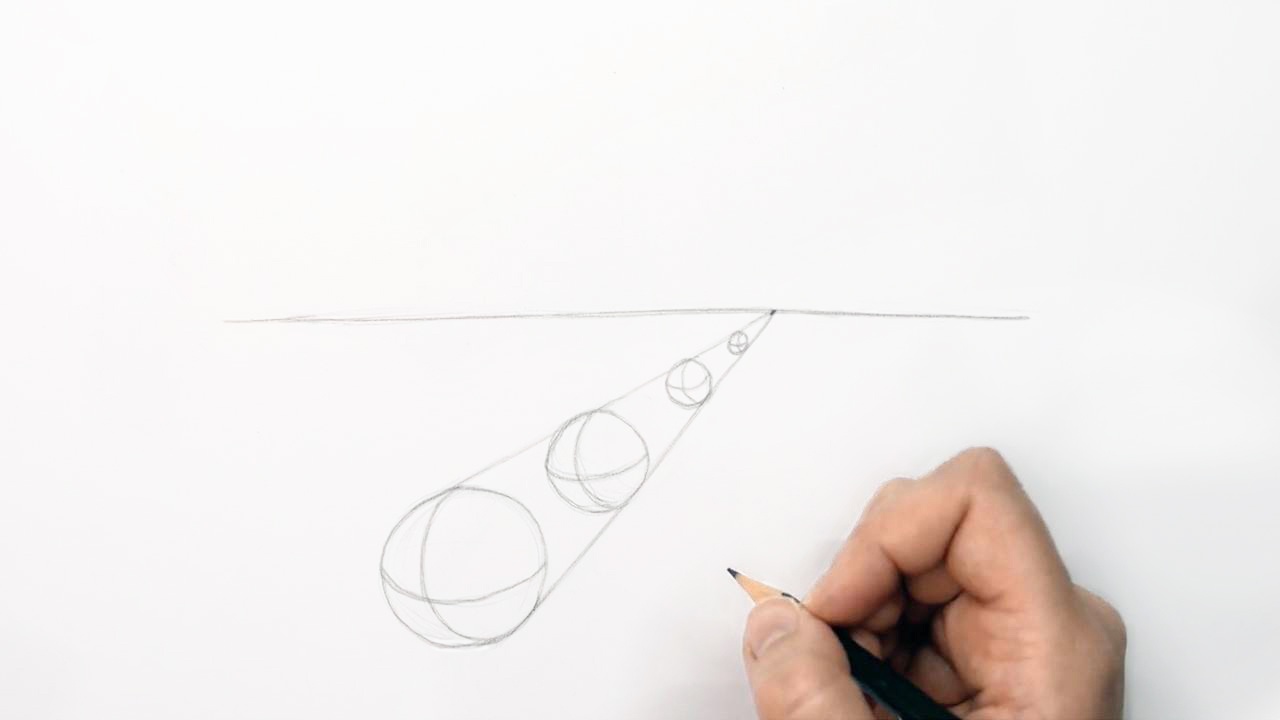
Element of Art: Space
Space is one of the elements of art. The elements are line, shape, form, space, texture, value, and color. We cover them all in a series of blogs.
Why Space?
Space is the area above, around and within objects. There are different ways to create the illusion of space in your drawing. For example by changing the size of an object, by overlapping objects, or by changing the placement.
To create space and depth in your drawing you have to draw with perspective, as things move away from your eye, things seem to get smaller so that’s how you need to draw them.
Practice Creating Space
To practice creating space start by drawing a horizon line (the horizon line is what you see at eye level). You’re going to draw four spheres to create space in perspective. Draw your first sphere below the horizon line. (Learn how to draw a sphere in our blog: creating 3-dimensional form)
Draw another sphere behind the first one but change the placement to a more distant one. Objects that are higher in the picture appear to be in the distance. You’ll also have to change the size of the sphere because objects that are closer to us are larger and objects that are further from us are smaller.
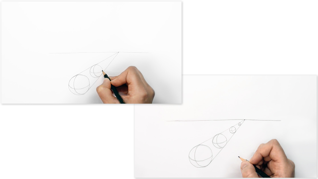
Draw two more spheres behind the first ones. How will you know how small or big you will need to draw the spheres? You will need to draw perspective lines from the first sphere all the way to the horizon line towards a vanishing point.
Perspective
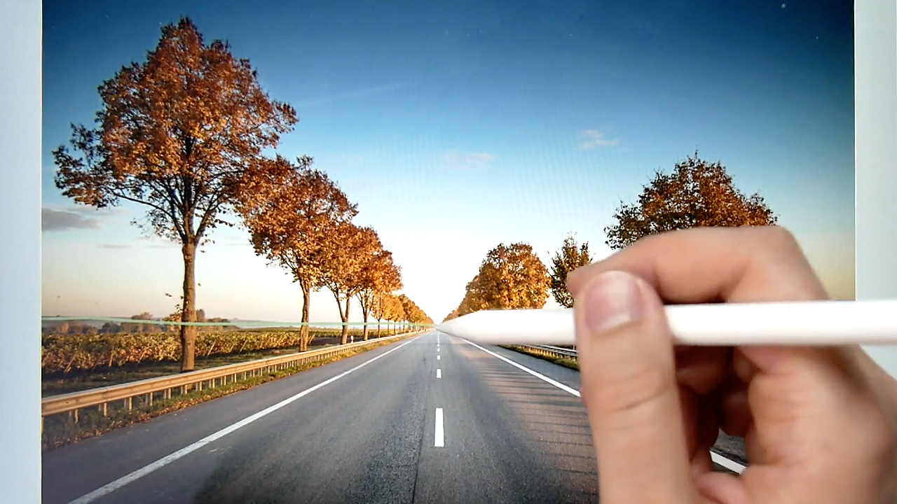
Another good way to practice drawing with perspective is by drawing a landscape with a row of trees. You can use a reference photo to help you. Draw over the horizon line so you can find your vanishing point. The white lines on both sides of the road help you find the vanishing point. The trees keep getting smaller until they vanish in the distance. Draw perspective lines towards the vanishing point to help you decide how big your trees should be and keep drawing them smaller the closer you get to the horizon.
Foreshortening
Foreshortening is the way we look at an object as it moves back in space. First hold your hand out flat in front of you, then when you tilt your fingers downwards the length of your hand appears to have changed. It looks smaller now. The palm of your hand looks bigger than it was before and your fingers look smaller. You know that your fingers aren’t smaller, they just look smaller because of the perspective.
Flat hand appears longer. Tilted hand appears shorter.

The effects of foreshortening:
- an object will get smaller as it moves back into the distance.
- an object will appear to be shorter or more compressed than it actually is.
- an object at the front will overlap objects behind.
Positive and Negative Space
We also have what you call positive and negative space. Positive space is the object itself and negative space is the space around and in between an object. For example, when you draw a portrait, the negative space is whatever’s around the person and the person itself is the positive space. Positive and negative space can form an important part of your overall composition. You can use positive and negative space to create a sense of balance and rhythm.
Composition
Composition is the arrangement or placement of a subject in your drawing. Even if your drawing skills are great, an interesting composition will make your drawing look better. If you draw a cat or a dog and you position the cat slightly off-center on the canvas, then that’s a composition choice. Or maybe you’re painting a still life of objects on a table. The way you choose to arrange those objects in your final piece is the composition.
Composition is important because it shapes the viewer’s experience of the artwork. We often choose to have a symmetrical composition (the same on both sides). You can also draw the subject a bit to the left or a bit to the right, doing this could make it more interesting.
Another example is, when you draw flowers it’s best to work in odd numbers. Most things in nature come in odd numbers, whether it's the leaves on a stem or the number of petals on a flower. You might not want to draw two leaves right next to each other, it will look better and more interesting when they overlap or have more space between them.
Balance
It’s important to create balance in your drawing. You want to make sure that there is something to look at on both sides. This doesn’t mean you need a symmetrical design because you can do this asymmetrically as well. For example, if you have one larger flower on one half of your drawing, you can draw two smaller flowers on the other side to create balance.
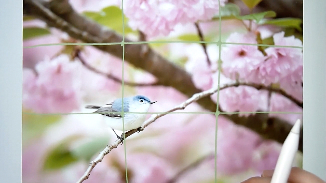
Have you ever heard of the Rule of Thirds? This is another way to make the composition in your drawing look more appealing. Instead of placing your object in the middle, you can divide your drawing paper into thirds by drawing 2 horizontal lines and 2 vertical lines. Then place your subject on one of the lines or where the lines meet.
Value
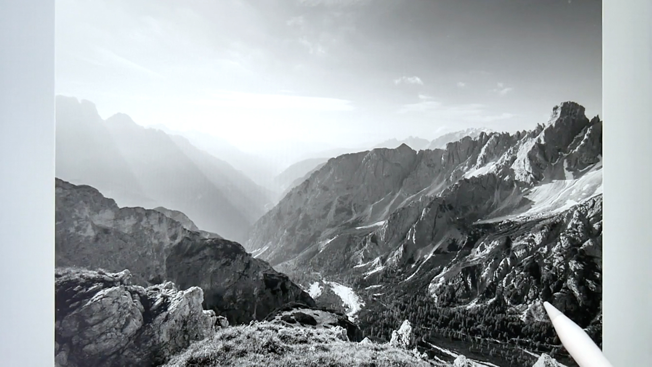
You can also create the illusion of space by using value. Take a look at the image below, the image starts off dark and as it moves away it gets lighter. Objects that are closer usually appear darker in value and objects further away appear lighter. The objects that are further away will also have less detail.
In the drawing course within my membership, I will teach you all the basic elements of art step by step and give you plenty to practice with. Want to join? Check out the details here.
Emmy
_
Want to read more? Check out the other topics here.
Want to be notified of new blog posts?
Sign up and you'll receive an email when a new blog is posted.
We won't send spam and you can unsubscribe at any time.
